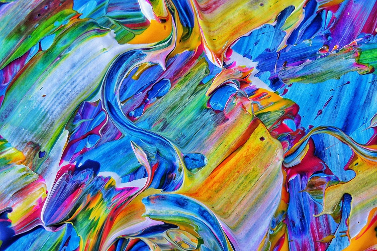
Color is a powerful communicator. It shapes our perceptions, evokes emotions, and influences behavior in subtle yet profound ways. From branding and interior design to fashion and art, the strategic use of color can alter moods, guide decisions, and even affect physiological responses. While cultural associations and personal experiences play a role, certain psychological patterns in how we respond to color are remarkably consistent. Understanding these dynamics can help individuals and organizations create environments and messages that resonate more deeply with their audiences.
Red: Stimulating and Urgent
Red is one of the most emotionally intense colors. It is often associated with passion, energy, and urgency. In marketing, red is used to grab attention and prompt action, which is why it frequently appears in clearance signs and call-to-action buttons. Physiologically, red can increase heart rate and stimulate appetite, making it a popular choice in restaurant design. However, its intensity can also evoke feelings of aggression or stress if overused. Balancing red with neutral tones can help maintain its impact without overwhelming the viewer.
Blue: Calming and Trustworthy
Blue is widely recognized for its calming and stabilizing effects. It conveys a sense of reliability, serenity, and professionalism, which is why it is often used in corporate branding and healthcare environments. Studies have shown that blue can lower blood pressure and reduce anxiety, making it ideal for spaces where focus and relaxation are needed. Lighter shades of blue promote openness and tranquility, while darker tones suggest authority and depth. The versatility of blue allows it to be both soothing and commanding, depending on its application.
Yellow: Optimistic and Attention-Grabbing
Yellow is the color of sunshine and optimism. It stimulates mental activity and encourages communication, making it a popular choice for creative spaces and educational settings. Yellow can also enhance concentration and memory retention. However, its brightness can be overstimulating in large doses, sometimes leading to feelings of frustration or fatigue. When used strategically, yellow can highlight key elements and inject warmth into a design. Pairing it with cooler tones can help balance its intensity and maintain visual harmony.
Green: Restorative and Balanced
Green is deeply connected to nature and renewal. It symbolizes growth, harmony, and balance, making it a favorite in wellness and environmental branding. The psychology of green suggests that this color promotes feelings of calm and restoration, often reducing stress and enhancing focus. Green is also associated with prosperity and stability, which is why it appears frequently in financial institutions and eco-friendly campaigns. Its versatility allows it to be used in both vibrant and muted forms, adapting to a wide range of emotional tones and design contexts.
Purple: Creative and Luxurious
Purple blends the stability of blue with the energy of red, resulting in a color that is both imaginative and regal. Historically linked to royalty and spirituality, purple evokes sophistication and mystery. It is often used in beauty and luxury branding to suggest exclusivity and elegance. Lighter shades like lavender can be calming and romantic, while deeper purples convey depth and introspection. Purple also stimulates creativity, making it a valuable tool in artistic and innovative environments. Its unique emotional range allows it to stand out while maintaining a sense of refinement.
Orange: Energetic and Sociable
Orange is a vibrant and energetic color that combines the warmth of red with the cheerfulness of yellow. It promotes enthusiasm, friendliness, and confidence, making it ideal for social spaces and youth-oriented brands. Orange can stimulate appetite and encourage interaction, which is why it is often used in food and entertainment industries. While bold, it is generally less aggressive than red and more approachable than yellow. Using orange in moderation can add vitality and warmth to a design without overpowering the viewer.
Black and White: Contrast and Clarity
Black and white are opposites as well as foundational elements in visual communication. Black conveys sophistication, power, and formality, while white represents purity, simplicity, and openness. Together, they create contrast and clarity, guiding attention and enhancing readability. Black can add drama and elegance, while white provides space and calm. In design, these colors are often used to frame and highlight other hues, creating balance and structure. Their psychological impact lies in their ability to simplify and elevate, making them essential tools in both minimalist and high-impact compositions.
Conclusion
Color is more than a visual element; it is a psychological tool that shapes how we feel, think, and act. By understanding the emotional and behavioral effects of different colors, individuals and organizations can make more intentional choices in design, branding, and communication. Whether aiming to calm, energize, inspire, or persuade, the strategic use of color can transform environments and experiences in meaningful ways.
Never Miss a Story from Mahevash Muses.